Record Collector's Web Watch
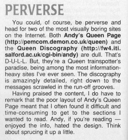
Issue 242 of "Record Collector" magazine (October 1999) featured a review of Queen web sites, and I am very proud to say my page got a mention!

The reviewer is quite correct in noting that the style of my page is very
different to the other Queen pages in existence. However, this is a deliberate
policy I have adopted for many years, for the following reasons:
- As a scientist, I have never had any talent in artistic directions. I am
a firm subscriber to the view that having a Desktop Publishing package doesn't
necessarily make you a competent publisher, and any "layout" I tried add to the
page would probably turn out to be pretty badly done.
- I believe that information is the foundation of the information
super-highway. My background is in academic research, and I prefer the style
of learned journals to populist magazines. That is the template that has
inspired me.
- There are a myriad of sites out there with good information and good
design, done by people who have skill in both areas. I believe that people
who want a pretty site with good layout should have access to those sites, but
that people who want a simple site with basic information should also
be catered for.
So I have little interest in adding graphics, frames, backgrounds, sounds or
visual enhancements (and I also have no time for doing so). However, I do take
very seriously any problems anyone may have with finding their way
around the pages.
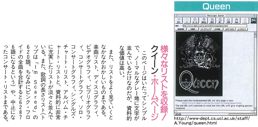
The 20th Feb 1996 issue of "FM Station" magazine in Japan had a review of web sites, with me getting a little mention

The first bit says something like "This page is very simple and has only letters on a normal gray, but it has a high documentary value", so I assume the rest is the same mixture of supportive and critical as the RC article. I can see it pointing out that "I'm Scared" had 620 words, so it must have commented on the list of songs in verbosity order. And I assume "62876" was the total words in all songs, as calculated at the time.
